Ghostery Midnight for iOS
CASE STUDY
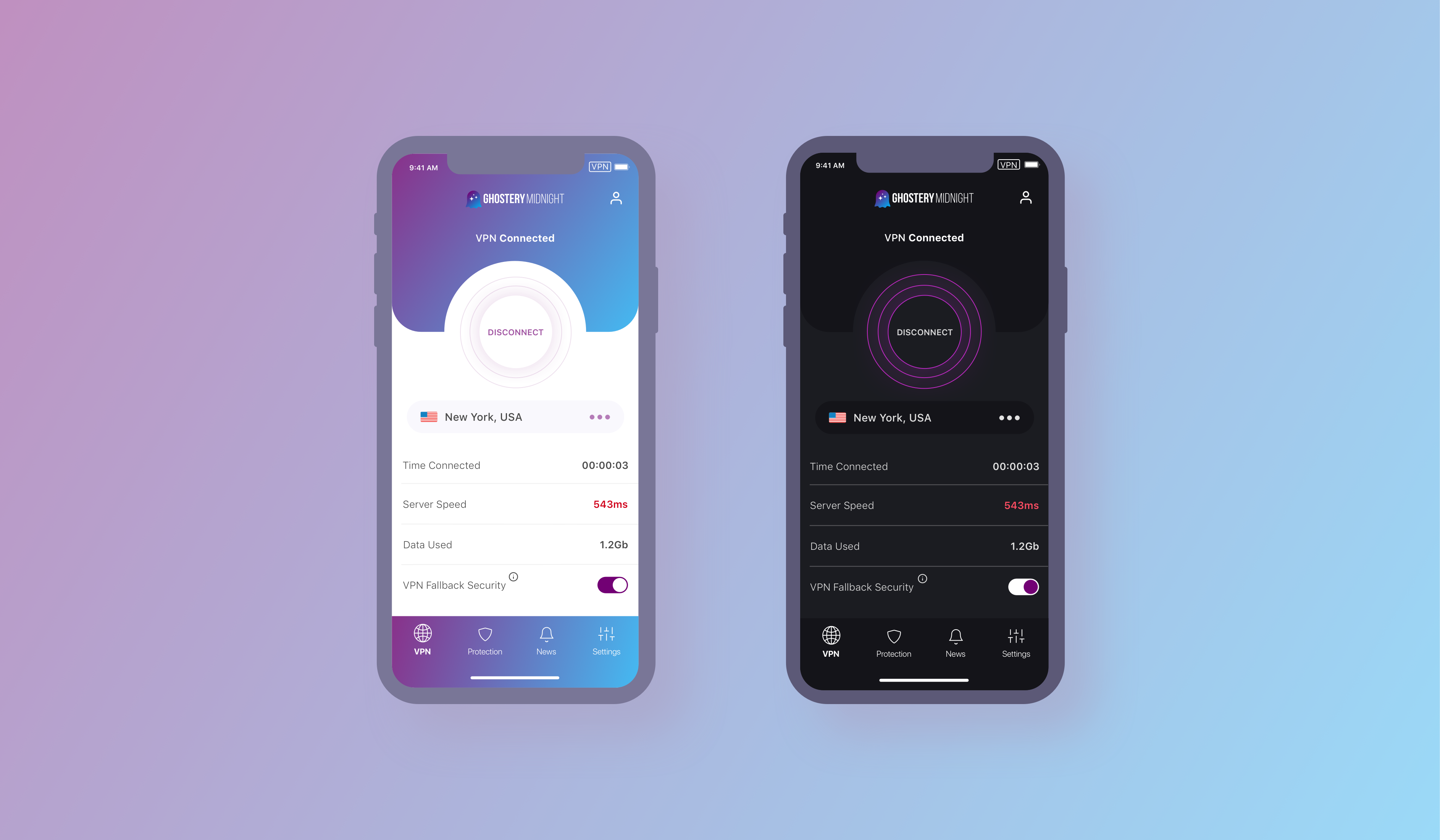
People are increasingly spending their online lives on their smartphones. As a result, these devices have become a veritable treasure trove of data for companies, providing information on location, browsing activity, shopping habits, social media, and a whole load of other personal identifying information (PII).
While Ghostery Midnight provides blanket protection of MacOS and Windows devices, users turn to other providers (or none at all) to protect the network activity on their mobile phones. We were challenged to design a Midnight iOS app, with the goal of extending the reach of our privacy protection and increasing the conversions of potential subscribers downloading Midnight for trial.
TIME FRAME
2020 - 2021
ROLE
Lead Designer
PLATFORMS
iOS
DISCIPLINES
UX research, Product Design, User Interviews, User Testing, Prototyping.
Discovery
We had some serious questions to answer before we dove into designing.
- What kind of protection can we offer users?
- How should our desktop offering translate to mobile?
- What conventions are used in the industry and how can we differentiate?
To get to the bottom of these questions and provide MVP designs to the key stakeholders, we - myself and Ghostery's talented UX researcher, Adamarie Laboy - performed a thorough research and discovery sprint before moving onto a design studio, user testing and subsequent prototyping.
USER SURVEY
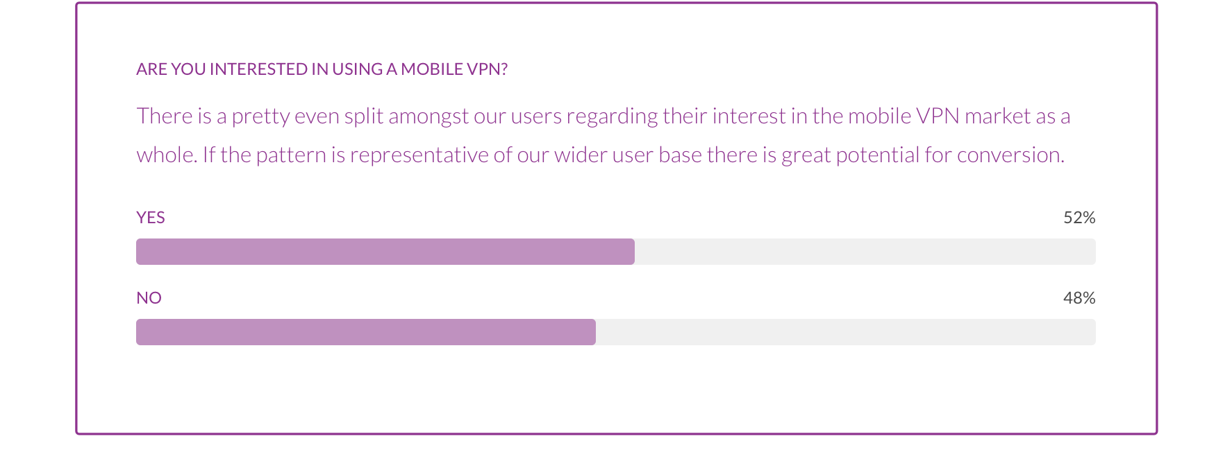
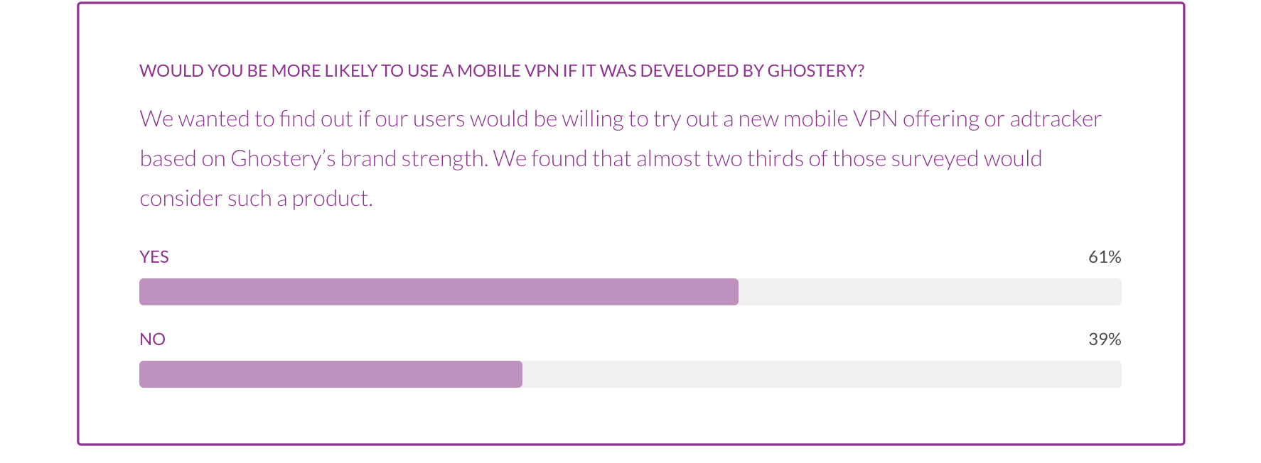
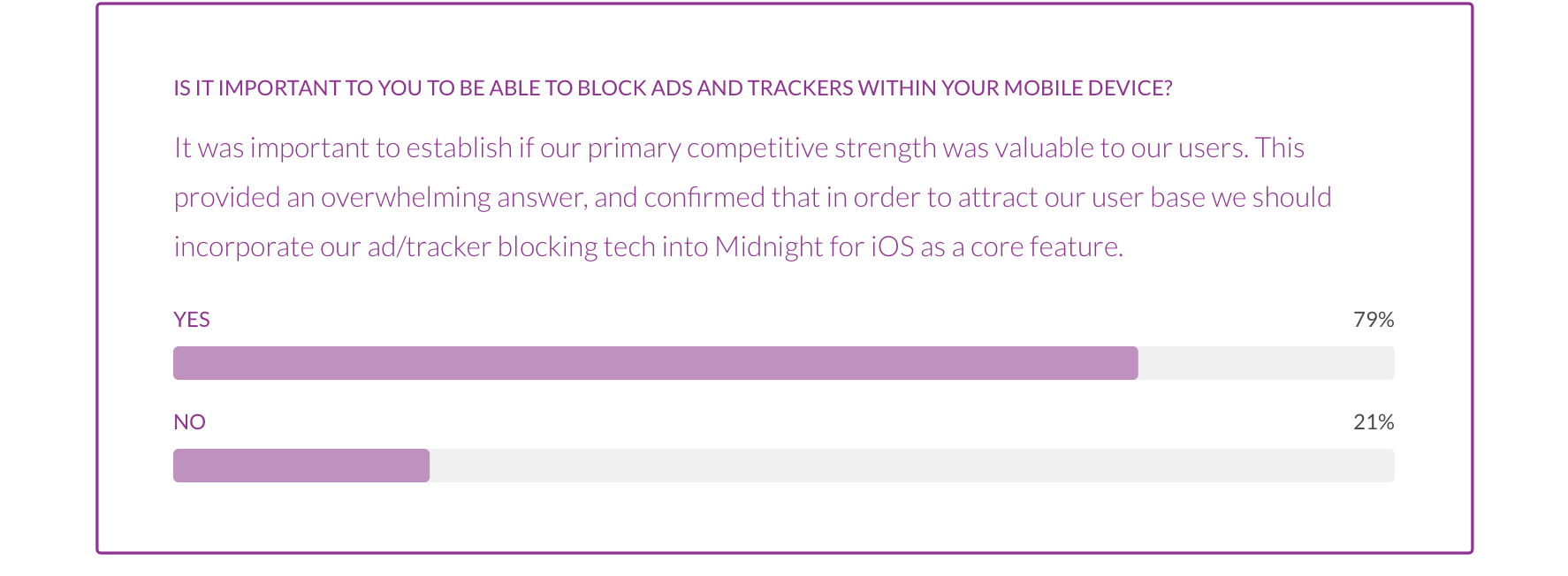
We set out to discover if the Ghostery Browser Extension user base had any interest in a mobile VPN with ad/tracker blocking capabilities. In order to achieve this we sent our a survey through our in-app messaging platform to ask our audience directly what they thought about the topic. We were able to capture 2,300+ survey results - all with one goal, do our users want a mobile VPN and do they want it from us?
TECH REVIEW
In order to establish clear constraints for the MVP designs of Midnight Mobile, we sat down with our tech team to discuss potential features that would be included, those that could be discounted entirely, and those that might be available further down the line. We also performed additional research into the current blocking capabilities, and limitations, of iOS devices, in conversation with experts within the field and our network.

COMPETITIVE ANALYSIS
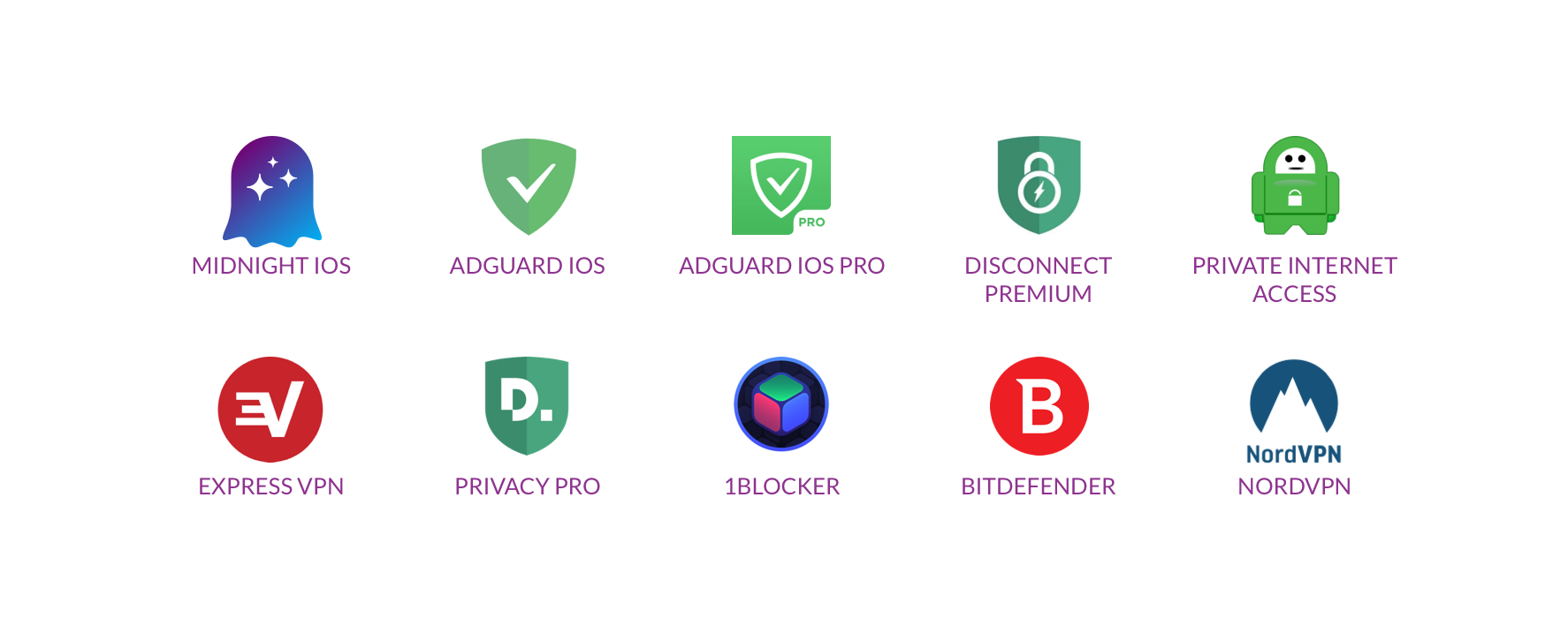
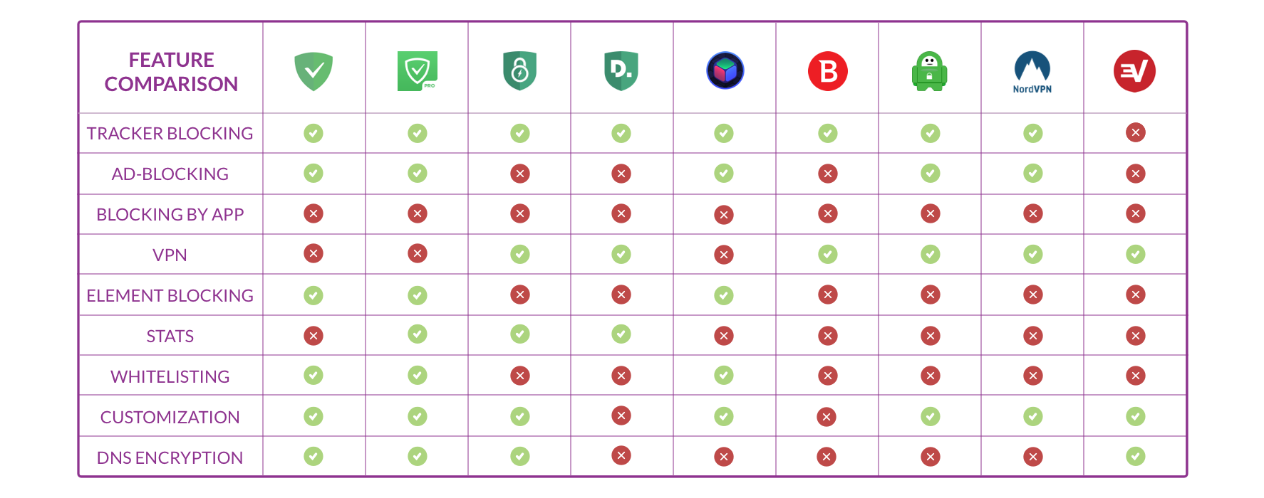
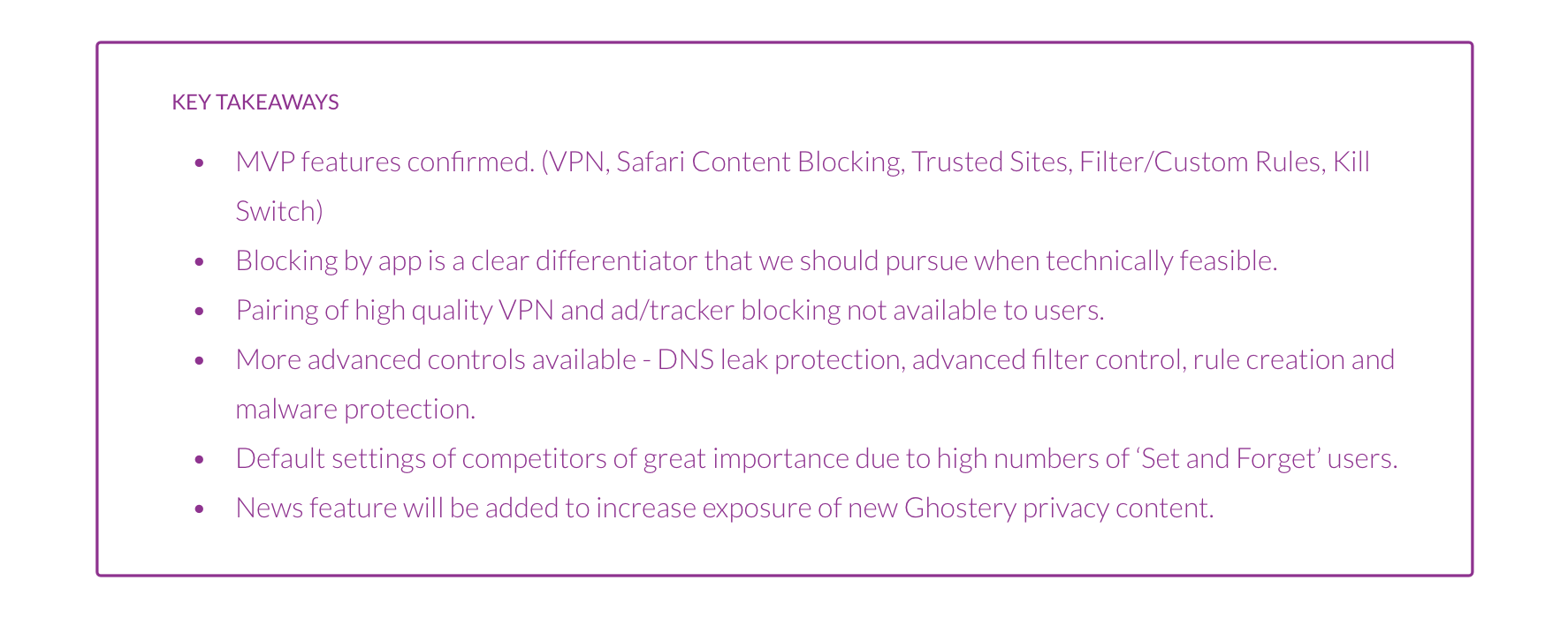
I reviewed a number of other iOS ad/tracker blockers as well as other popular VPN providers, some of whom offer the same content blocking capabilities as part of their feature suite. The analysis aimed to determine design trends, feature sets, the default settings and the upgrade up-sell mechanisms employed across the sector.
Ideation
Once we had established the features that were available to us (with regard to both technical constraints and in-house capabilities), it was time to put pen to paper and marker to whiteboard.
LOW FI SKETCHES AND DESIGNS
We honed in on two different options, a Midnight transplant, which would more or less be a reskin of the desktop app (and would make development quicker…) and another design with a touch more flair, which leaned on the design trends prevalent in the industry and other non direct competitors.
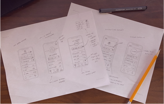
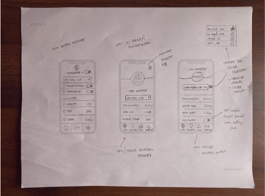
We needed some quick feedback so we threw some rough sketches up on the wall and let other Ghostery colleagues redline away. Having wiped away the tears (of constructive criticism), Adamarie and I applied the finishing touches to the consensus design and got ready to test them out using a Framer prototype.
USER TESTING
Getting the prototype into the hands of some privacy-focused users was a really exciting proposition for us and we were able to find 6 willing participants relatively quickly. Each of them had varying levels of privacy knowledge and tech-savvy, and the group was split evenly between those who knew of Ghostery and those who did not.
Given the relative simplicity of the prototype and our need for rapid feedback, we organized 6 task based, moderated, usability tests using userinterview.com. We also performed a number of word association tests lead by our UX writer to ascertain ideal names for new features.
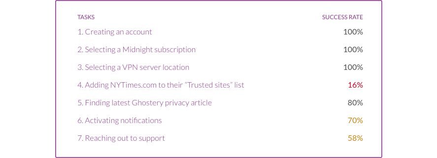
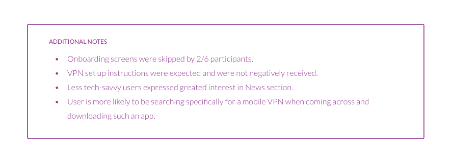
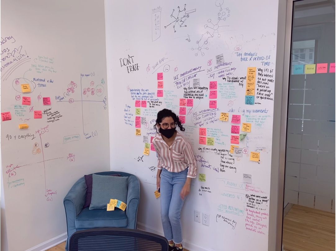
Armed with the results from our testing, we went back to the whiteboard to figure out the key issues and how we might solve them. It was clear from that certain features (Trust List and Support) were proving difficult to find and use.
As such we adapted the information architecture using the reactions of the participants when attempting to complete task #4. We also performed further A/B testing in order to find an icon that would better represent the Support function.
Midnight for iOS
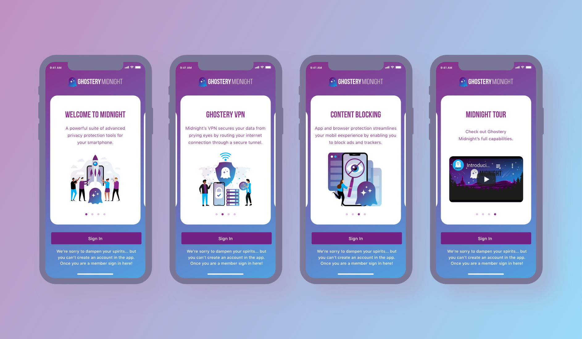
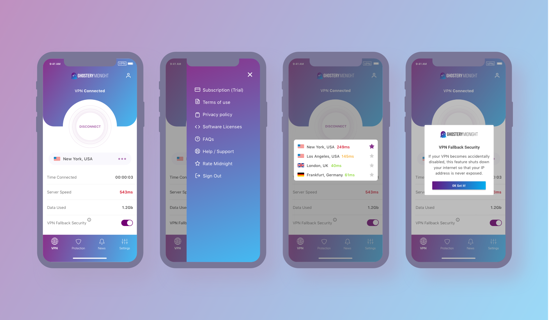
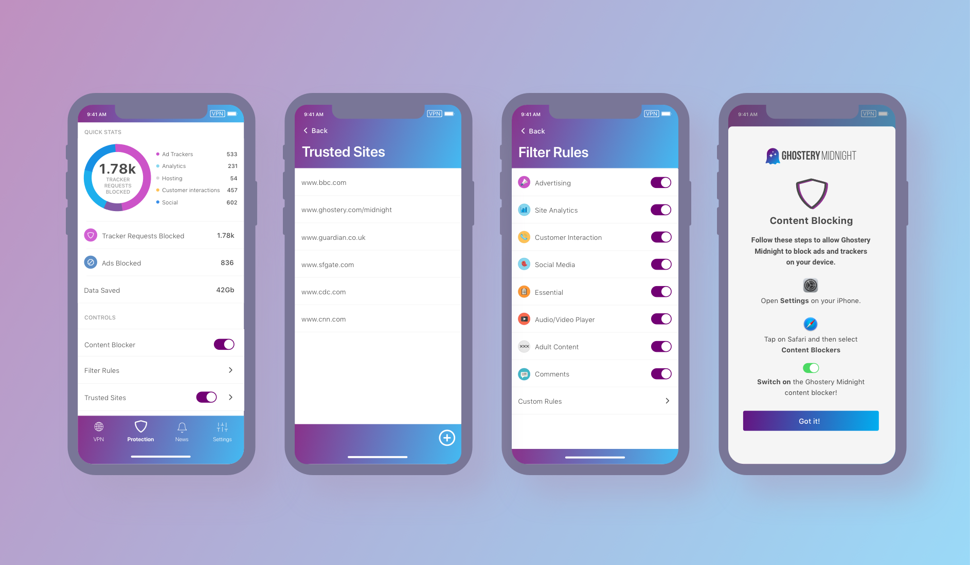
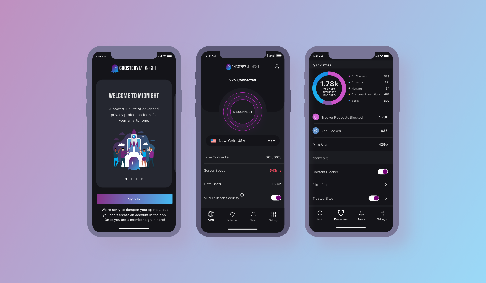
With the raft of change applied from our user testing, we have been able to finalize Midnight for iOS 1.0.
ONBOARDING
HOME
PROTECTION
DARK MODE
What next?
Ghostery Midnight for iOS is currently in development, aiming for an August 2021 release. In the meantime, the team is continuing to test out our current ideas and messaging with our users. So far the reception has been extremely positive and Ghostery Midnight users are excited to add another weapon to their privacy armory!
Next Up...