Ghostery Midnight
CASE STUDY
Ghostery’s adorable little mascot - Ghosty - has been protecting users’ data for more than 10 years, and with more than 7 million loyal users it’s safe to say that Ghostery is one of the heavyweights of in-browser ad-blockers. But what happens beyond the browser…?
An increasing number of people are becoming aware of the data risks posed by other applications and the personal information that leaks from them drip by drip. Furthermore - in an effort to subvert privacy extensions, browser operators look set to alter the rules of their products to make tracker blocking almost impossible in the browser. A privacy platform that blocks trackers beyond the browser could be a key part of Ghostery's new privacy suite subscription strategy.
Ghostery Midnight’s goal is to provide users absolute peace of mind when going about their online lives, by protecting their devices at the application level.
TIME FRAME
2019 - 2021
ROLE
Lead Designer
PLATFORMS
MacOS, Windows
DISCIPLINES
UX research, Product Design, User Interviews, User Testing, Prototyping.
Discovery
We had some serious questions to answer before we dove into designing.
- What kind of protection can we offer users of different OS?
- How do we leverage our awesome technology into an offering that users will value?
- Do our users and target audience appreciate the need for such protection?
In order to answer these questions we carried out an extensive research and discovery sprint, incorporating a number of techniques (stakeholder interviews, tech constraint review, competitor analyses - feature comparison, branding and onboarding analyses, user surveys, interviews and testing).
TECH REVIEW
It was important for us to begin the project with all constraints identified, one being our tech capabilities. After a number of conversations with our engineering team and their network it was clear what the potential core functionalities of our MVP could be. The question was wouold these be valued by our users and if so would we package these features for optimal user experience?

USER SURVEY & INTERVIEWS
We set out to find out whether our users really needed a product like this. There was of course no point in wasting our time building it, if we couldn’t demonstrate demand. We put together a survey which we sent out to users, including some exploratory questions about the actions they had taken thus far to protect themselves online, and subsequently organized a number of interviews to delve deeper.


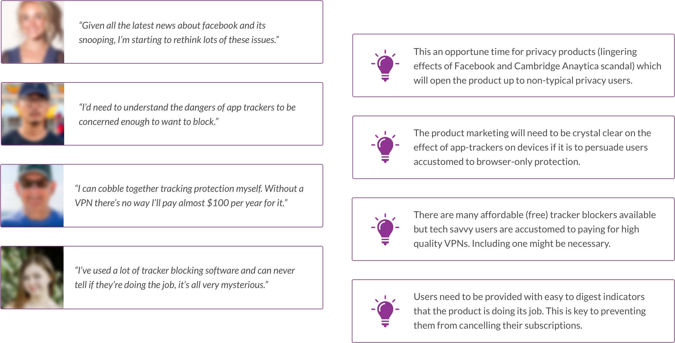
The users we selected for interview were, in line with the Ghostery user base, a diverse group! Wide ranges in age, profession and technical ability all catered for. To our delight, many of the interviewees were enthused by the prospect of a system wide privacy product from Ghostery. Yet it was clear from the offset that a not-insignificant number of our users were entirely unaware of the presence of trackers in non-browser applications, and of those who were aware, some did not have a clear understanding of the benefits of blocking these trackers.
If Midnight was to realize its potential beyond our beloved, die-hard, privacy nerds, we would need an intuitive design and clear strategy for demonstrating the product's value.
COMPETITIVE ANALYSIS
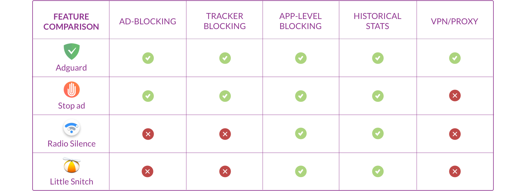
We took time to review our competition, and subsequently test them with users. We were able to identify a number of features that would be expected in our product (in addition to the core capabilities). We also studied the way that users were educated through onboarding and terminology. Perhaps more importantly we found that almost none of the competitors offered VPN/proxy protection.
Ideation
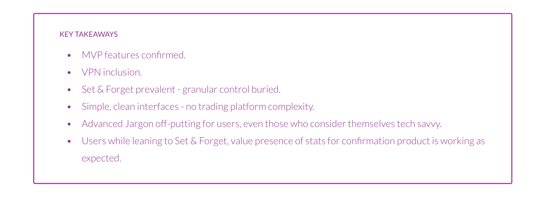
After sifting through the competitive research, tech constraints and user interviews, it was time to put pencil (and then pen!) to paper. While the feature set was relatively clear to us, how it would be presented to users was still up in the air. After an afternoon of discussion and whiteboard defaceing with the design team I set to sketching the most fleshed ideas for a ‘set and forget’ version of midnight as well as a more robust version with granular controls and in depth stats.
LOW FI SKETCHES AND DESIGNS
One of the more contentious topics of our discussions had been whether our users would derive more value from a menu bar app (similar to a typical VPN - sketch below) or a more comprehensive web app, offering a higher degree of granular control - and potential complexity.
As such - I sketched out versions for each; an interface with advanced controls buried a little deeper and a comprehensive ‘privacy dashboard’ or ‘task manager’ version.
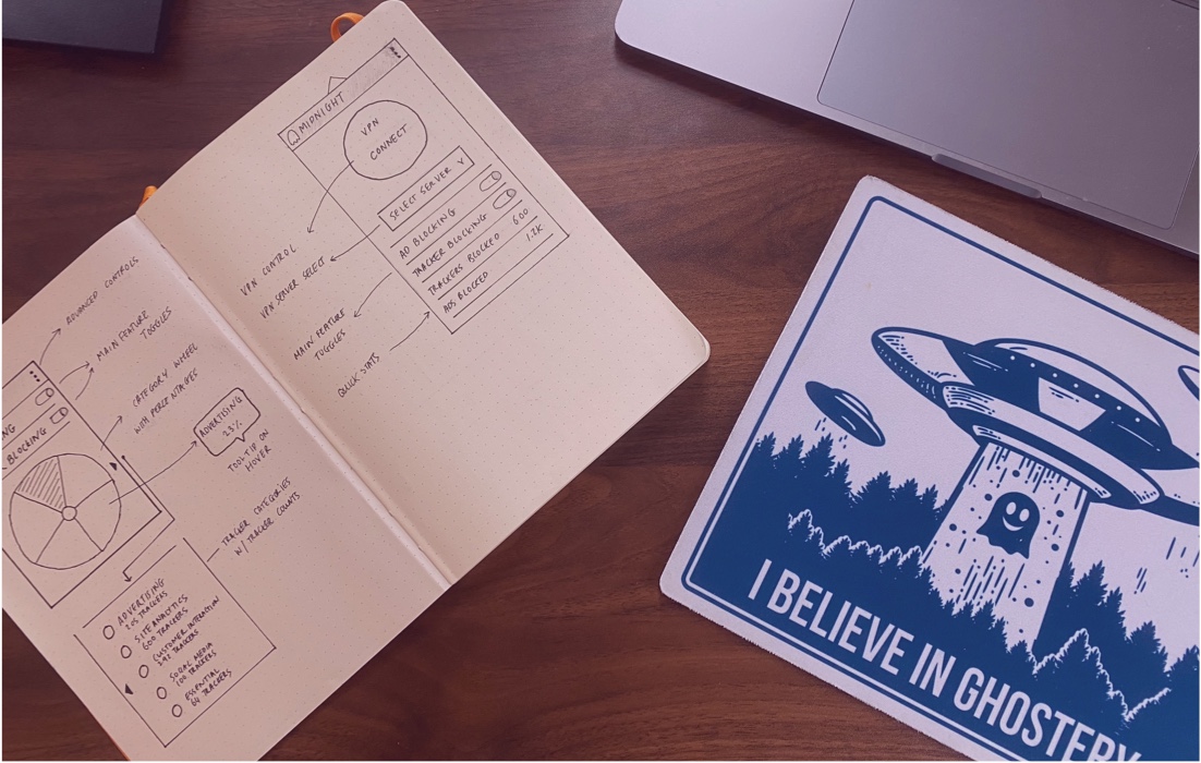
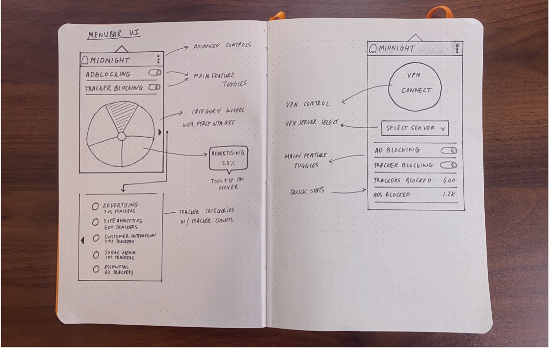
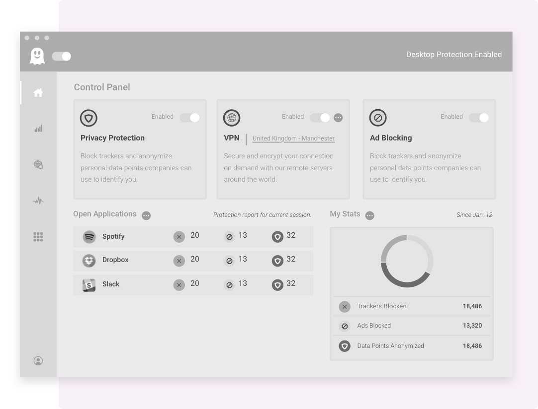
I ran through the sketches with the team and once we had ironed out a number of key details I moved onto some low fidelity mockups which we tested with 4 Ghostery users and 4 non users.
The medium fidelity prototype included an example landing page and tour of the application. We included the landing page to start testing product messaging.
The preference for the dashboard version was clear. We also found that the general functionality and iconography was intuitive to both Ghostery users non-users once they had time to explore.
Our sample landing page highlighted a persistent issue - that many users still skim read and find application-level blocking difficult to grasp, which would be a key point for us to improve our communication of the benefits of the product.
Ghostery Midnight
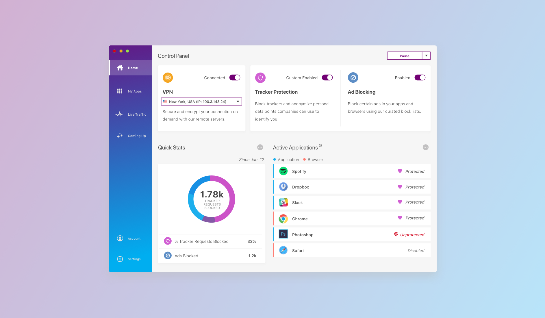
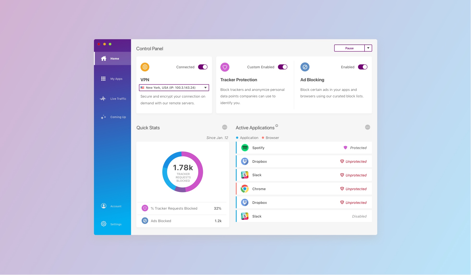
Ghostery Midnight takes Ghostery's powerful ad and tracker blocking technology, coupled with a brand new VPN, to the device level, using an intuitive and brand-consistent interface.
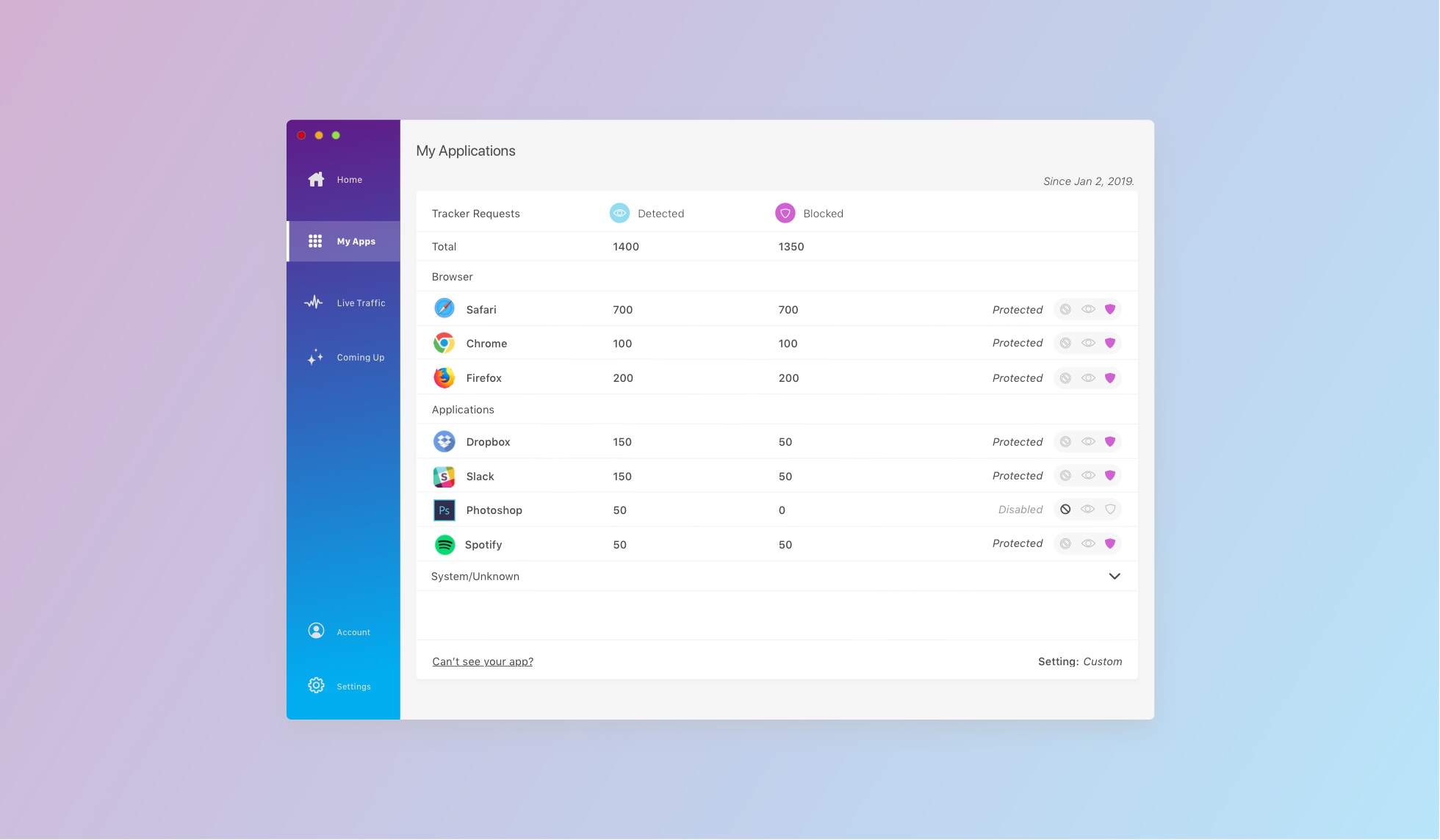
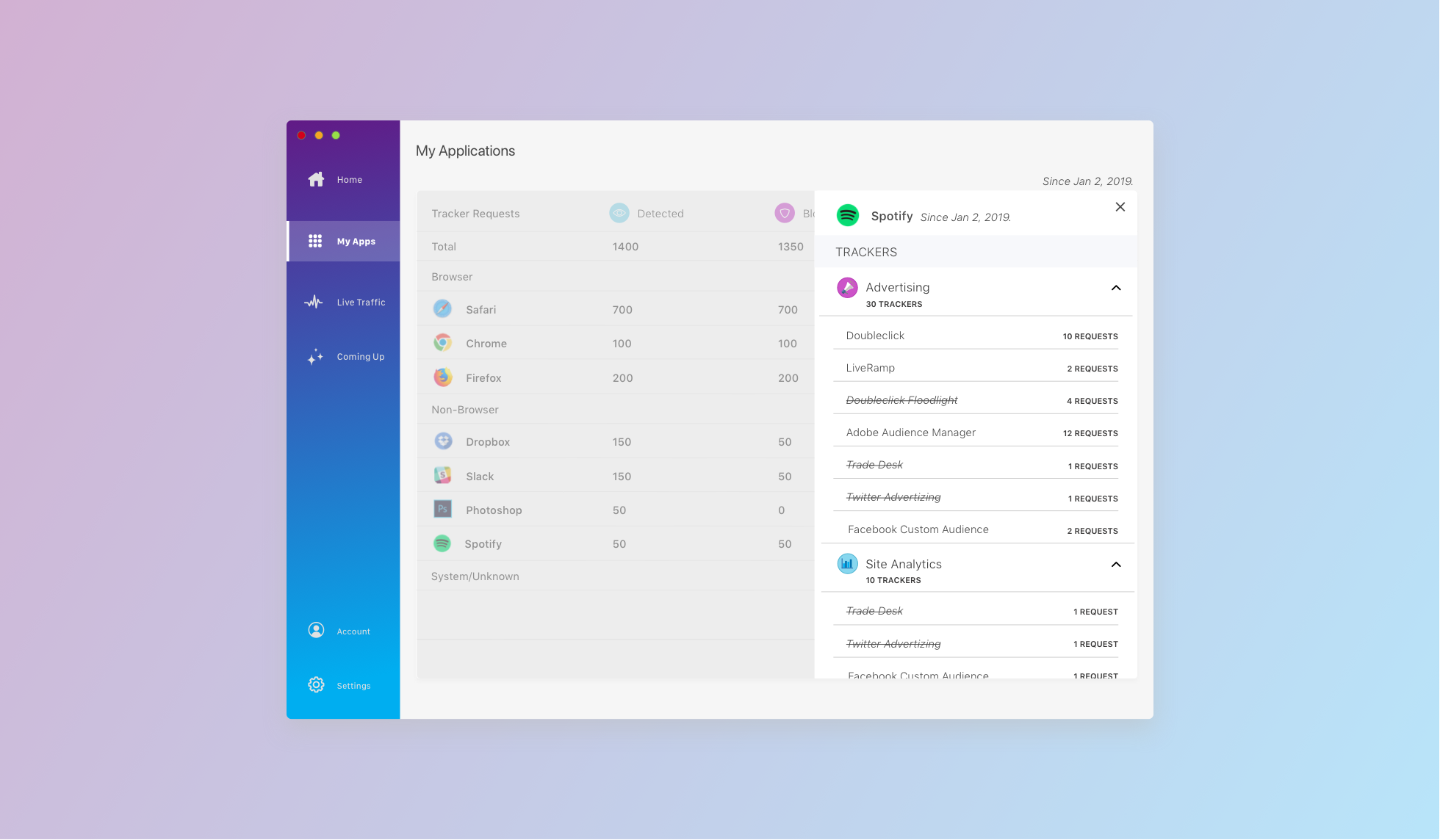
Manage privacy settings and check out blocking progress from your Home dashboard. Dive deeper into the tracker ecosystem present on your device's applications with My Apps.
HOME
MY APPS
MY APPS - DETAILED VIEW
What next?
Ghostery Midnight was released in beta form in December 2019. It has been well received by our users who consider it a powerful addition to their privacy toolkit. As always, there are still improvements that can be made. Users should be able to parse their blocking stats with greater ease, with additional useful data such as Ads blocked. Our power user base is excited about Midnight but in some cases has been left disappointed by the customization options at present. '
We are exploring all these opportunities and more, as we look to make privacy beyond the browser an important part of our users online experience.
Next Up...